There is something irresistible about the 70s colour palette. Those warm, earthy tones — mustard, rust, olive, and plum — feel both grounded and romantic. They remind me of old Hollywood films shot in golden light, of secondhand sweaters that smell faintly of cedar, and of afternoons spent flipping through vintage magazines in a Brooklyn coffee shop. The 70s colour palette isn’t just a trend; it is a mood that can make modern dressing feel more intentional and personal.
I have always been drawn to these shades because they flatter so many complexions and mix together like a well-edited playlist. The trick is to avoid looking like you walked out of a period drama. Instead, you want the 70s colour palette to feel like a natural part of your wardrobe — a few key pieces that add warmth and depth to your everyday outfits.
Why the 70s Colour Palette Still Feels Fresh
The appeal of the 70s colour palette lies in its ability to feel both cozy and sophisticated. Unlike the bright, synthetic colors that dominated later decades, these hues are muted and organic. Rust red suggests autumn leaves; olive green brings to mind vintage army jackets; mustard yellow has the warmth of old wallpaper in a sunlit room. Plum adds a touch of richness without being flashy.
When I wear these colors, I notice they make other pieces in my closet look better. A camel coat reads richer over a rust turtleneck. A pair of faded jeans feels more intentional with an olive blazer. The 70s colour palette works because it does not scream for attention — it invites you to look closer.
One of my favorite ways to use this palette is through layering. Start with a neutral base — cream, camel, or chocolate brown — and add one or two of these saturated tones. For example, an olive corduroy skirt with a mustard cashmere sweater feels like a perfect fall afternoon. Adding a plum scarf or rust leather boots ties the look together.
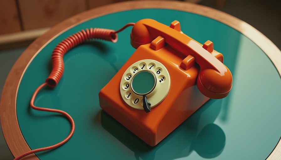
How to Build Outfits Around the 70s Colour Palette
Building a wardrobe around the 70s colour palette does not require a complete overhaul. A few intentional pieces can give your existing clothes a new life. Look for items in natural fabrics like corduroy, suede, wool, and cotton — these textures amplify the earthy quality of the colors.
Start with one hero piece in a standout shade. A rust-colored blazer, for instance, can be worn with white jeans and loafers for a spring outing, or layered over a black turtleneck with wide-leg trousers for evening. The key is to let that one saturated color lead the outfit, while everything else stays calm.
Another approach is to focus on accessories. A mustard crossbody bag, olive suede boots, or a plum knit beanie can inject the 70s colour palette into outfits that are otherwise neutral. This is especially useful if you prefer a minimalist style but still want that vintage warmth.
For those who love prints, look for patterns that incorporate these hues. A floral blouse with rust and mustard tones, or a plaid skirt that mixes olive and plum, can become the starting point for a whole look. Just keep the rest of the outfit simple to let the colors breathe.
Common Mistakes to Avoid When Styling the 70s Colour Palette
The biggest mistake I see is trying to include every color from the 70s colour palette in one outfit. Too many warm tones can feel muddy or overwhelming. Instead, pick two or three and repeat them in different pieces. For example, olive trousers with a rust belt and a plum bag creates harmony without effort.
Another pitfall is ignoring the role of neutrals. Brown, cream, and gray are not boring — they are the canvas that makes the 70s colour palette sing. A mustard sweater looks even more vibrant against a white shirt collar, and rust pants feel grounded with a camel coat. Do not be afraid to use neutral layers as separators between strong colors.
Finally, avoid modern silhouettes that clash with the vintage feel of the colors. Skinny jeans and a tight top in these shades can look costumey. Instead, choose shapes with a softer drape — wide-leg pants, A-line skirts, boxy blazers, and relaxed knitwear. The 70s colour palette pairs naturally with the relaxed, fluid silhouettes of that era.

Where to Find the 70s Colour Palette in Thrift Stores
Thrift shopping is the most rewarding way to collect pieces in the 70s colour palette. Look in the sweater section for cashmere or lambswool in olive, rust, mustard, or plum. Corduroy pants and skirts are also common and often come in these shades. Vintage suede jackets in russet or chocolate brown are treasures when you find them.
When you are browsing, pay attention to the fabric label. Natural fibers like wool, cotton, and suede hold color beautifully and age well. Avoid synthetic blends that look faded or plasticky. The 70s colour palette shines brightest in materials that have some texture and depth.
I have found some of my best pieces — a rust wool coat, an olive A-line skirt, a mustard silk blouse — in small neighborhood thrift stores and estate sales. The hunt is part of the pleasure, and each find feels like a small piece of history.
Bringing It All Together
The 70s colour palette is more than a nostalgic nod to the past; it is a tool for building a wardrobe that feels warm, thoughtful, and personal. Whether you add a single accessory or build an entire outfit around these hues, the result is a style that looks collected, not crowded.
Start small. Pick one color from the 70s colour palette that speaks to you — maybe mustard or olive — and find one versatile piece in that shade. Wear it with your favorite jeans and a neutral top. See how it makes you feel. Chances are, you will want another. That is how a real wardrobe grows: slowly, with intention, and with colors that make everyday life a little more beautiful.

No letters yet — be the first to write.