There is something about the 1970s color palette that feels both grounded and dreamy. I think of the light in an old film like An Unmarried Woman, or the way a thrifted suede jacket in rust brown can make an entire outfit feel like it belongs to a story. The 1970s color palette is not about screaming for attention — it is about warmth, depth, and a quiet confidence. If you have ever found yourself drawn to a burnt orange blouse or a pair of olive corduroys, you already know the pull of that decade. And the best part? These colors are surprisingly easy to wear in 2025, without looking like you are headed to a costume party.
The Key Colors of the 1970s
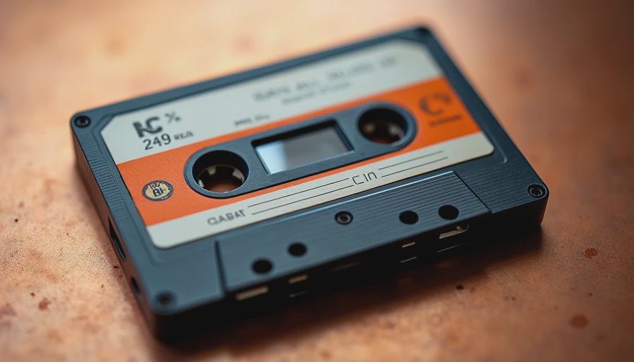
When I think of the 1970s color palette, a few specific shades come to mind first. Avocado green — that soft, slightly yellowed green that shows up on old kitchen appliances and in the linings of vintage coats. Harvest gold, warm and buttery. Burnt orange, like the last leaves of autumn. Mustard yellow, a little spicy. And then there are the browns: chocolate, caramel, and the deep rust of an old leather sofa. These colors are earthy, often muted, and they do not compete with each other. They feel natural in the way that wood, clay, and dried flowers feel natural.
Of course, there are brighter moments too. The 1970s had its share of vibrant magenta, bright turquoise, and even lime green — especially in the disco years. But the palette I reach for most is the grounded one: the colors that look like they have been faded by time and sunlight. Those are the ones that mix beautifully with modern neutrals like cream, navy, and charcoal.
How to Wear 1970s Colors Today
The trick to wearing the 1970s color palette without looking like a period piece is balance. You do not need to go full Brady Bunch. Instead, pick one or two key pieces in a 70s shade and let them anchor your outfit. A pair of wide-leg corduroy trousers in olive green can be worn with a simple white crewneck sweater and leather mules — suddenly the outfit has a soft seventies feel without trying too hard. Or try a suede a-line skirt in burnt orange with a black turtleneck and ankle boots. That kind of pairing keeps the vintage spirit intact while still feeling like you belong in this decade.
I also love using 1970s colors as accents. A mustard yellow scarf tied to a handbag. A brown leather belt with a brass buckle. A pair of tortoiseshell sunglasses. These small touches bring the 1970s color palette into your everyday style without overwhelming your closet. It is the difference between wearing a costume and wearing an influence.
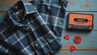
Another approach is to build a capsule around a few signature 70s neutrals. Think of a wardrobe built on cream, camel, olive, and rust. Those four colors can mix and match endlessly, and they look especially beautiful in textured fabrics like brushed cotton, wool, and suede. The 1970s color palette is particularly forgiving when it comes to layering, because the tones are warm and harmonious. You can throw a mustard cardigan over a rust dress and add olive boots — and it will all make sense, like a landscape in autumn.
Pairing 1970s Hues with Modern Silhouettes
Where the 1970s color palette really shines is when you contrast it with a modern fit. A 70s-inspired blouse in a rich brown or rust color looks fresh when tucked into high-waisted straight-leg jeans rather than the original flared cut. A vest in harvest gold can be worn over a simple white button-down and modern trousers for a look that nods to the decade without quoting it directly.
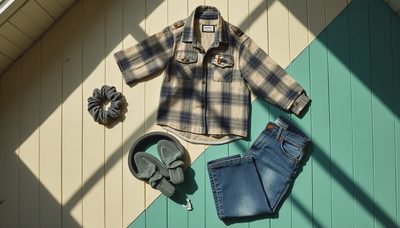
I find that the 1970s color palette works particularly well in outerwear. A long camel coat or a burnt orange parka can become the centerpiece of a winter wardrobe. And because the tones are so warm, they pair beautifully with denim — a classic blue jean is the perfect partner for nearly every shade in the 70s spectrum. If you are thrifting, keep an eye out for wool sweaters in those autumn tones. They are surprisingly easy to find, and they wear well through cold months.
A Few Notes on Fabric and Texture
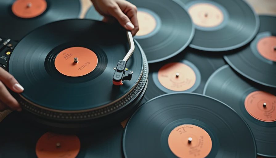
The 1970s color palette is deeply tied to texture. Avocado green looks different in a smooth cotton than it does in a chunky knit. Burnt orange reads warmer in suede than in silk. When you are building a vintage look, pay attention to the feel of the fabric. Corduroy, suede, wool, and leather are the materials that bring these colors to life. I have a thrifted wool blazer in a deep rust brown, and it is more versatile than I ever expected — I wear it with jeans and a white tee, or over a floral dress, and it always looks intentional.
One of the reasons I return to the 1970s color palette so often is that it feels collected rather than crowded. These colors do not shout. They settle into a room softly, like the light on a September afternoon. And they remind me that style is not about wearing the most obvious thing — it is about wearing something that makes you feel like the person you want to be. Whether that is a woman in a brown suede jacket sipping coffee in a neighborhood café, or a woman in a mustard sweater walking through the park, the 1970s color palette offers a kind of quiet beauty that never really goes out of style.
If you are new to these tones, start small. A scarf, a bag, a pair of gloves. Let the 1970s color palette introduce itself to your wardrobe one piece at a time. You might find, as I did, that it is one of the easiest and most rewarding color stories to live in.

No letters yet — be the first to write.